Thursday, January 31, 2008
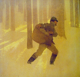
Illustration Friday - Tales and Legends

Monday, January 28, 2008
Maxfield Parrish: Wrap Up
Although Parrish is well known for his color work, his early illustrations were in black and white and used lithographic crayon. The following illustration was for Washington Irving's History of New York by Diedrich Knickerbocker (1899). You can see all of Parrish's illustrations for History of New York in the wonderful Children's Book Illustrators Gallery at http://www.nocloo.com/. I love the beautiful, delicate range of values and shading in these illustrations. Although Parrish used lithographic crayon, I think similar results could be achieved using charcoal.

I also really like Parrish's monochromatic work. Here are two examples. The first is called Winter, and the second is called Harvest. I love the moods that Parrish creates.

In February, I plan to study N.C. Wyeth.
Sunday, January 27, 2008
Maxfield Parrish and Symmetrical Balance
Very Little Red Riding Hood (1897)

Jello Ad (1922)


Now that I am attuned to symmetrical balance, I am noticing it more often. My son Christopher loves the I Spy books. As we sat together reading the other day, I noticed that the cover of Can You See What I See? Once Upon a Time is for the most part symmetrically balanced.

I am keeping this design technique in the back of my mind. I am waiting for the right occasion to try it out.
Saturday, January 26, 2008
Maxfield Parrish and the Use of Pattern
In 2008, I plan to study one illustrator or artist per month. For each artist, I will ask myself the following questions:
- What aspects of this artist's work appeals to me?
- What aspects don't appeal to me?
- Does this artist use techniques that I want to use in my own artwork?
In January, I studied Maxfield Parrish (1870-1966). Parrish was a highly successful American illustrator. I read the book Maxfield Parrish by Coy Ludwig (1973), which I recommend. Wikipedia's entry on Parrish provides a good overview of Parrish's life and work and has references for further reading.
Parrish is well-known for his landscapes and unique colors. These aspects of Parrish's work appeal to me least. Instead, I am drawn to his graphic work. I particularly like his use of:
- Pattern in design.
- Symmetry in design.
- Lithographic crayon.
- Monochromatic color schemes.
Here are two examples of Parrish's use of pattern. This first illustration is called The Idiot (1910), and the second one is called Man in an Apple (1911). Both were covers for Collier’s Magazine. Notices how Parrish primarily uses pattern, rather than value, to effectively render the folds in clothing. The patterns also add a decorative element to the design.


I have already put this technique to use in my Illustration Friday entry for stitch.
I'll discuss Parrish's use of symmetry, lithographic crayon, and monochromatic color schemes in future posts.
Monday, January 21, 2008
Illustration Friday - Plain

Sunday, January 20, 2008
Saturday, January 19, 2008
Birthday Greeting

Friday, January 18, 2008
First Colored Pencil Drawings

I am taking the online colored pencil course Getting Started in Colored Pencil with Bet Borgeson. This is a 7 week class, and I have just completed week 2. The class emphasizes color. These are my first colored pencil drawings. The exercise was to use color as a device to express form. Prismacolor pencils on Strathmore 400 Series Drawing medium paper (9" x 12").
Tuesday, January 15, 2008
Illustration Friday - Stitch

Sunday, January 13, 2008
Work In Progress: Stitch

Thursday, January 10, 2008
EDM #153 - Draw Something In A Plastic Wrapper

Sunday, January 6, 2008
Illustration Friday - 100%

100%. It is way overrated. In school, we are taught to strive for the grade 100%. At our jobs, we are encouraged to give more than 100%. It is the way to get ahead. But 100% can be a killer. So just say no to 100% and perfection. And encourage your kids to say no, too. Striving for 100% can lead to fear of failure, which leads to fear of trying, which kills creativity. Striving for 100% leads to burn out, exhaustion, and poor health. Just say no!
Watercolor and gouache on 5" x 8" Acquarello Watercolor Studio 140 lb cold pressed paper, touched up using Photoshop Elements.
Here is the original watercolor version, before the touch up. I used Photoshop Elements to alter the color of the "100".


