Saturday, March 29, 2008

Peter Max

I just completed a study of Peter Max. Peter Max is a commercially successful American artist whose artwork appears on posters, clothing, dishes, watches, clocks, pillows, postage stamps, cars, and airplanes, as well as on canvases. I used the book The Art of Peter Max by Charles A. Riley II, which has excellent reproductions of Peter Max's work. In addition, there is a Wikipedia entry on Peter Max , and the web site lines and colors has an article on Peter Max. The official Peter Max website is here.

Peter Max was born in 1937 in Berlin. During his childhood, his family moved around, first to Shanghai (where his family lived next to a Buddhist temple and a Sikh monastery), then to Israel (via India, South Africa, and Italy), and finally to the United States (via Paris). Peter Max's cosmopolitan upbringing influenced his later art.

Peter Max received extensive training in art. At first, he did realistic art (e.g., portraits), but quickly moved to graphic design and the pop/psychedelic art style for which he is famous. Love and Different Drummer (below), both created in 1968, are examples of his pop art style.


I personally find the pop art style very appealing, and I want to understand why the images work. The images make use of only three design elements: color, shape, and line. The colors are bright and tend to be primary. I can't discern a color scheme per se, but do notice that Peter Max makes use of analogous colors and complementary or near complimentary colors, all in the same piece. For example, in Love, the colors inside the Love letters are analogous blues and purples. The purple part of the 'L' is next to yellow background, and the blue part of the 'L' is next to an orange solid circle and a lighter orange background.

Pop art is a style that looks easy but it is very hard to do well. I tried to do the Illustration Friday prompt "Pet Peeves" in a pop art style; the results are here. While my Pet Peeves piece is not one of my better efforts, I do like the bright colors and was surprised to see how far the design element color can carry a piece of art.

Starting in the late 1970's, Peter Max started to move towards a Neo-Expressionism style. He did a number of Americana pieces; here is one example. I love the bright, loose, primary colors and the minimal black contour drawing that defines the face.


Here are more examples of Peter Max's Neo-Expressionism style (most of which are in acrylics). Until I embarked on this study, I had no idea that Peter Max did this type of work. I only knew his pop style.


Finally, Peter Max has some pieces that interpret masterpieces in a fun and original way. Mona Lisa, below, is an example.

I tried this approach for the Illustration Friday prompt "Heavy". The result is an interpretation of Rubin's Venus in Front of the Mirror . I find this approach to the masters to be more creative and enjoyable than blindly copying their work.


Wednesday, March 26, 2008

Illustration Friday - Pet Peeves


I chose to illustrate a pet's peeve. My dog Shelty is part hound and loves to chase squirrels and rabbits. Unfortunately for her, she never gets the opportunity, since she is always on a leash. I am sure she would say this irks her. Prismacolor Marker on Bristol Smooth paper, touched up with Photoshop Elements.

Here is the untouched up version.


Finally, here is a version in watercolor that has a more limited palette. The black outlines are marker.


Monday, March 24, 2008

EDM #163 - Draw a Deck of Cards

I focused my efforts on the beautiful patterns made by the fanning cards.

I don't play cards anymore. When I was growing up, my parents enjoyed playing pitch. I grew up in rural upstate New York, where my mother was a member of a card club. Once a month, ladies of the club would get dressed up, get together, and play pitch. The ladies took turns hosting. I remember my mother preparing and serving the food when she was hostess: chips, dips (sour cream with dried onion soup added, a homemade shrimp dip), and little wieners in a sweet and sour sauce. Drinks were whisky sours and rum and coke. The ladies sometimes played for pocket change. I remember some of the ladies' names: Lottie Janowski, Dot Mower, and Caroline Wilzak. In my present life, I don't know anyone with cool names like Lottie or Dot.

As a teenager and young adult, I played pitch with my parents. I enjoyed it ... it is just that I don't know anyone now who likes to play cards.

My son Christopher wants to learn to play Go Fish. I have no idea how to play ... guess I can google the rules.

Saturday, March 22, 2008

Associations

Here is a fun drawing exercise from Keys to Drawing with Imagination by Bert Dodson: Use an idea from one drawing to trigger an idea for a new drawing. Draw from imagination and keep the drawings simple, without backgrounds. For example, in the sequence below, I start with something with branches: A tree. That made me think of something with many legs: An octopus. That made me think of something with many feet: A centipede. That made me think of many shoes.

I can fill pages with these associations:


Thursday, March 20, 2008

Illustration Friday - Heavy


The first thing that came to my mind for heavy was weight. I wanted to do a beautiful full-figured woman. Rubens is known for featuring full-figured women, so I used Venus in Front of the Mirror as inspiration for this drawing. Chalk and Micron pen on paper.

Tuesday, March 18, 2008

Hippity Hop


This started out as an Easter card, but I took a left turn somewhere along the way. My 8-year old son's interpretation of this painting? The Easter bunny delivers a rotten egg to a bad boy.

Sunday, March 16, 2008

The Princess Farms


I arbitrarily chose two words, princess (a person, entity, or thing) and farm (a place or location), and then put them together into a drawing.

Thursday, March 13, 2008

The Witch's Last Sight on Earth

The idea here is to show the witch's viewpoint just after Dorothy throws the water at her. I tried to make Dorothy a tad sinister. I struggled with the splashing water. Also, the water should obscure the lower part of her pigtails (once you make a mistake with pen, there is no going back).

Tuesday, March 11, 2008

The Persistence of the Witch


What if when the Wicked Witch of the West melts, she melts like molten metal? The result might be something like Dali's Persistence of Memory.

Sunday, March 9, 2008

The Wicked Witch of the West Reversals

This is an exercise from Keys to Drawing from Imagination. First, illustrate a story, myth, nursery rhyme, or fairy tale in a straight forward way. I chose to illustrate the Wicked Witch of the West melting.

Next, choose one element in the illustration and replace it with its opposite. I chose the witch and replaced her with Glinda, The Good Witch of the North. "Opposite" is open to interpretation. For example, Dorothy would be another possibility.


Next, choose a different element from the original drawing and reverse it. I chose melting and replaced it with freezing. Here the Wicked Witch is trapped in ice. When I drew it, I was thinking about the end of one of the Christopher Reeve Superman movies where the villains get trapped inside some type of mirror or glass (only to be released in a subsequent movie). Another "opposite" here could be evaporating.

Saturday, March 8, 2008

Illustration Friday - Garden


The Wicked Witch of the West nourishes the earth.

Micron pen (.01) on 9" x 12" Strathmore 400 Series Sketch Pad paper.

Sunday, March 2, 2008

Illustration Friday - Leap

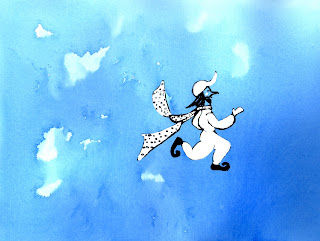
My concept is an imaginary man leaping through the sky:

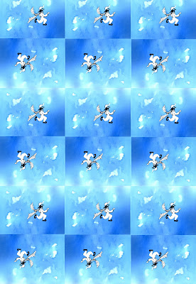
Here is the single image repeated multiple times using Photoshop Elements:


I used watercolor and ink on 90 lb watercolor paper. I used Photoshop Elements to duplicate and combine the images. I leave Dallas today to go to a conference in Santa Clara, California. It lasts all week. I'll be commenting on other's blogs during the week, but will not be posting until next Saturday.

EDM #160 - Draw a Trophy or Award


This was a tough one for me. We tend to toss any trophies and awards that come our way, so I had a hard time finding something to draw. I no longer like or seek awards. Awards are judgmental and can cause us to behave in ways that is pleasing to others but not necessarily ourselves. I now aspire to follow my inner muse and do work that meets my personal standards, not external standards.

This is a drawing of an award I did keep, because it is a cute stuffed animal and my son Christopher likes it. I received it about 10 years ago. I was working at a software consulting company and we had just completed a large project. As a reward, we were given a fancy dinner. A limo transported all the team members from and to their homes. At the dinner, each team member was given a gift that represented something about their personality. I was given a stuffed animal bull dog, because that was my nick name. I was known as bull dog because if I was given a difficult technical problem, I wouldn't give up until I solved it. It is more of a memento than an award.

Mechanical and 3B pencil on 9" x 12" Strathmore 400 Series Sketch Pad paper.

Saturday, March 1, 2008

N.C. Wyeth

I studied the illustrator N.C. Wyeth in February. Wyeth (1882-1945) is considered to be one of America's greatest illustrators. In addition, he is the father and grandfather, respectively, of artists Andrew Wyeth and James Wyeth.

I particularly liked the reproductions in the books Wondrous Strange: The Wyeth Tradition and An American Vision: Three Generations of Wyeth Art. You can also find many N.C. Wyeth paintings here.

I also studied design in February. I read Design Basics (2nd Edition) by David A. Lauer. N.C. Wyeth excelled at design and composition, so I studied Wyeth's paintings in the context of design principles. Here is an example of how I approached this project.

The following painting is an illustration for the book Treasure Island by Robert Louis Stevenson. A black spot is a piece of paper with a black spot on it. If a pirate receives a black spot, it means he is to be executed.

The Black Spot They Were Collected in a Group (1911)


Here is an analysis of the painting in the context of design principles.

Unity
  • Proximity: All the figures are very close to one another.
  • Repetition: The pirates in the background have similar dress.
  • Continuation: The barely visible pirate in the right background is connected to the back wall, the back wall is connected to the left shoulder of the back standing pirate and to the left-most crouching pirate's neck, and the left-most crouching pirate's leg is connected to the kneeling pirate with the knife. The pirate in black in the foreground is not connected to the other picture elements, but his right-hand heel almost merges into his shadow and the floor. The left side of the wall runs into the floor.
  • Unity with Variety: There is some variation in the pirates' clothing.
Emphasis/Focal Point

I see the focal point as being the book and knife: the making of the black spot.
  • Emphasis by Contrast: The focal point is one of the most lighted area of the painting (although the back right wall and white pirate shirts are also very lighted).
  • Emphasis by Isolation: I don't think this technique is used here.
  • Emphasis by Placement: This is the primary technique used here: All the pirates are looking at the book and knife.
Balance

I struggle with balance. This is the principle I understand least. This painting uses Asymmetrical Balance, as opposed to Symmetrical Balance.
  • The dark left-hand wall and the mass of the three left-hand pirates seem to balance the mass of the single standing pirate dressed in black.
Scale/Proportion
  • The pirate in black in the foreground appears much larger than the other pirates. I have never read Treasure Island, so I can't say if the foreground pirate is more significant than the rest. Did Wyeth deliberately make this pirate dominate the others in the painting?
Illusion of Space

There is a sense of depth in the painting.
  • Size: The foreground pirate is larger than the background pirates.
  • Overlapping: The foreground pirate hides parts of the background pirates.
  • Vertical Location: The upper pirates are farther back than the lower pirate.
  • Aerial Perspective: I don't think this is used here.
  • Linear Perspective: Is this one-point perspective?
  • Amplified Perspective: I think the pirate in black may be an example of amplified perspective.
  • There are a number of other techniques--Multiple Perspective, Oriental Space, Open Form/Closed Form, Recession, and Spatial Puzzles. I don't think any of these are used.

It is nice to know that the two simplest techniques, size and overlapping, are also very effective.