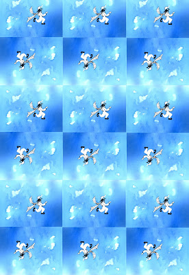
 Here is the single image repeated multiple times using Photoshop Elements:
I used watercolor and ink on 90 lb watercolor paper. I used Photoshop Elements to duplicate and combine the images. I leave Dallas today to go to a conference in Santa Clara, California. It lasts all week. I'll be commenting on other's blogs during the week, but will not be posting until next Saturday.
2 comments:
I think I prefer the lone leaper -- so much easier to see the nice detail.
I think I have to agree, ars. The leaper doesn't show up well at all in the tiled version. Maybe more contrast is needed?
Post a Comment